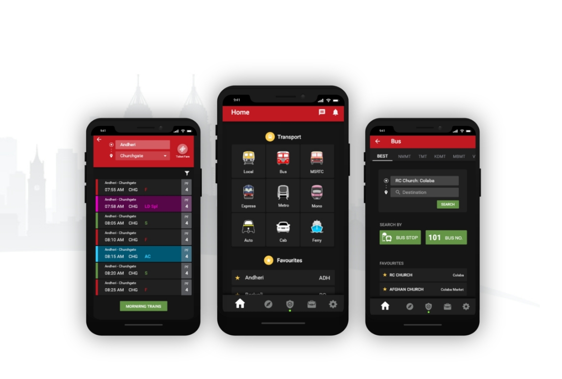
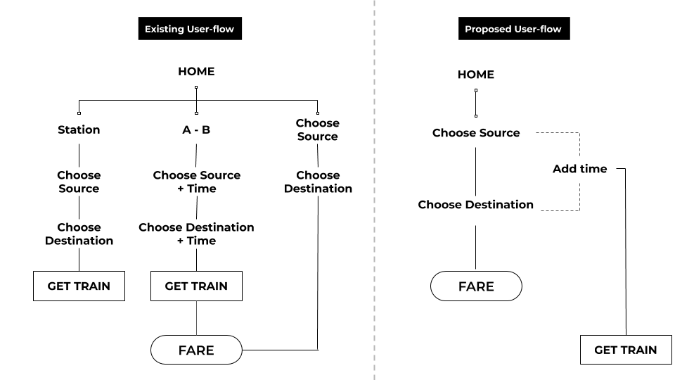
Redesign Casestudy

Problem Statement

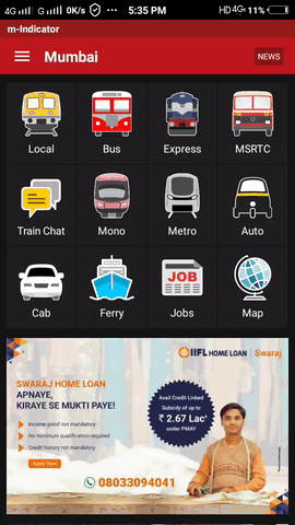
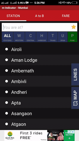
M-Indicator is Mumbai's largest commute information application. However, there are some problems which the users face in the application even after using it for a pretty good time. Being one of those, I planned to understand the flaws, user's pain points and thus redesign the application.

User Research

I researched the habits of commutators. When, where and for what do they use this application. Hence I could understand their motives and requirements instead of just changing the app according to what I have observed. I researched in 2 phases:

  • Survey: To get a big picture of the usage of the application
  • Task Analysis: To understand how the users currently interact with the interface and what challenges do they face
I distributed a google form to the app users. The response is as follows:
portfolio-image
portfolio-image
From the major difficulties faced by the user, I did task analysis of how do people currently search for trains and timings

How will you search for a train from Airoli to Thane?

portfolio-image

How will you check it's fare?


portfolio-image

Defining User flow

I redefined the user navigation, by reducing the number of clicks to search a particular train, it's timing and the fare. Following is the improved user flow:

portfolio-image
portfolio-image

Redesigning UI Elements


  1. Since transportation forms the major purpose of use for the users, I segregated the features into categories and made the major feature more accessible. I shifted the other features in the menu as different categories.
  2. portfolio-image
  3. Replaced the traditional hamburger menu with the more accessible bottom navigation bar. The options in the sidebar navigation were transferred to the settings page.
  4. portfolio-image
  5. Restructured hierarchy of actions. For example: Choose railway line first and then search for the station.
  6. portfolio-image
  7. Removing redundancy of tabs
  8. portfolio-image

Final Prototype

Having redefined the user flow and redesigned the interaction elements I could create an entirely new application with a reduced number of click and task time

portfolio-image

What did learn?

  1. Redesign of any application is majorly driven by user inputs and their reviews. They play a major role in determining the flaws of any application and their possible solutions.
  2. Design patterns change with time. I realised how design elements have changed over time. This forms a user pattern and therefore the application should be designed considering the design trends to help the user feel familiar with the application.
  3. Since this application is being used by the locals of Mumbai for a long time now, I realised that completely changing the information architecture and colour scheme of the application would lead to the decrease in confidence that the users have built for using the application. Therefore, I implemented the new design in a way that the user does not notice the major changes and follow the same old user flow to complete the task.